Brand work that builds trust before anyone reads a word
Brand and identity work has been a constant thread through two decades of practice — running alongside the product and UX work, often informing it. Identity design requires a discipline that's distinct from but deeply connected to digital experience design: the ability to distill what an organization actually is into a mark, a system, and the small decisions that keep it recognizable everywhere it shows up.
This section collects selected brand and creative work from consulting engagements under DN Creative LLC — from a data-driven thought leadership campaign for one of the country's largest open-air retail operators, to a full brand and live website built in weeks for a solo therapy practice, to identity systems for a cybersecurity firm and a Dutchess County property maintenance company. All vanilla HTML/CSS — no frameworks, no templates.
DLC Management Corp.
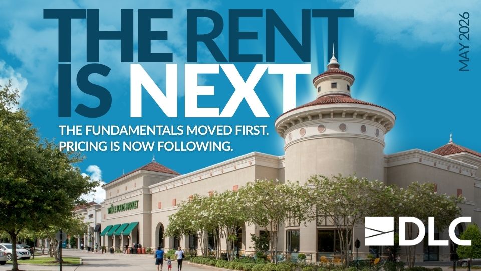
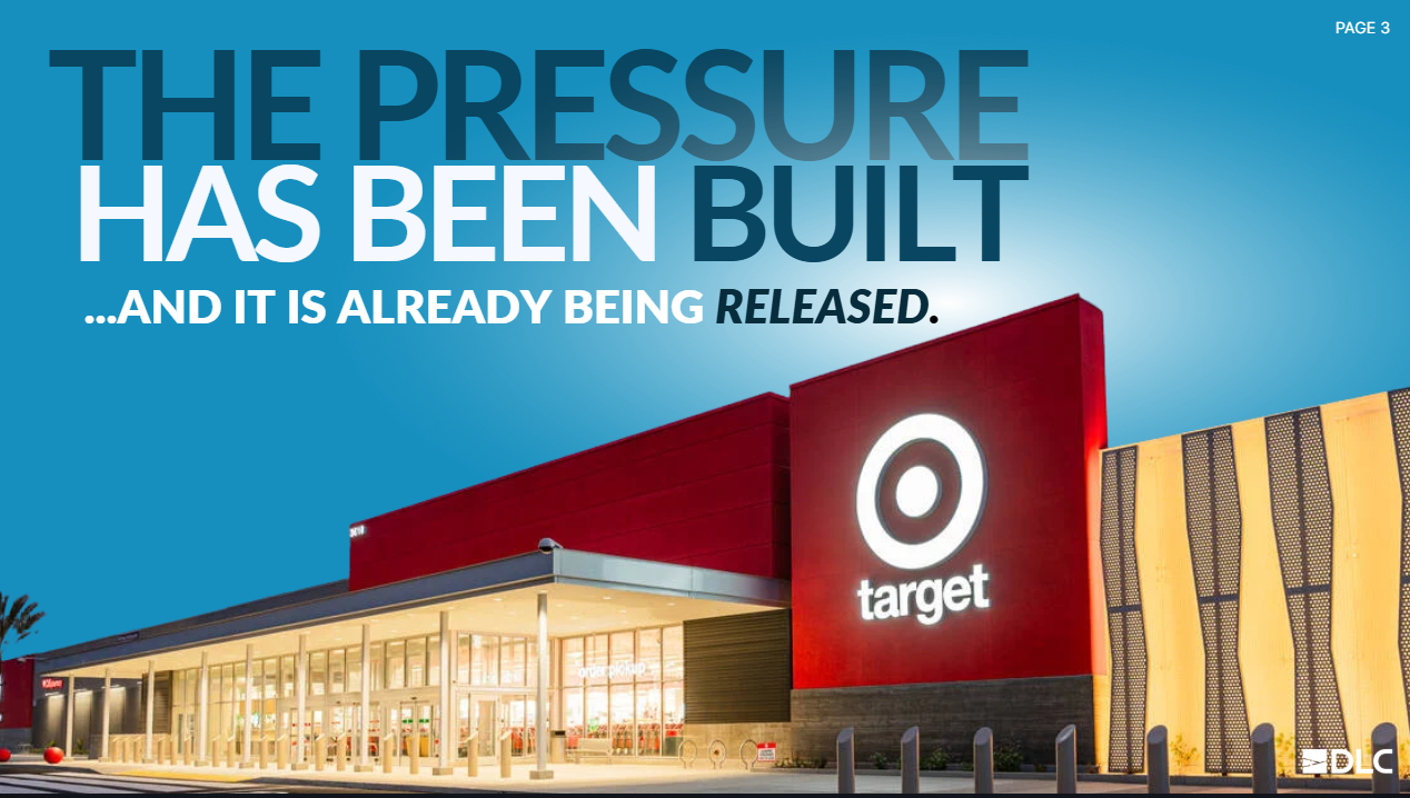
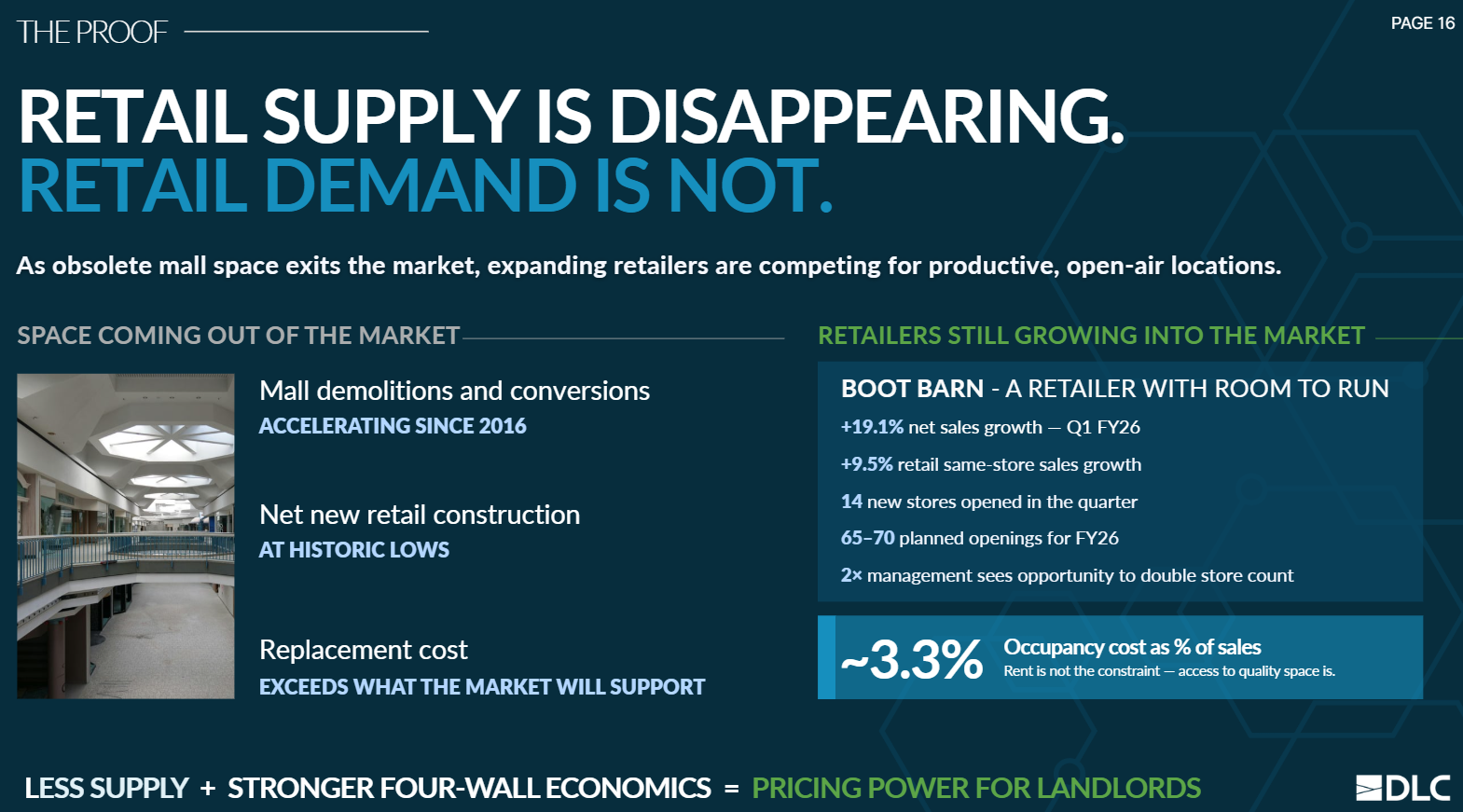
"The Rent Is Next" — campaign suite for one of the Northeast's most active retail real estate operators
DLC Management Corp. operates one of the largest open-air retail portfolios in the northeastern United States. They had the data and conviction. They needed the visual firepower to match. The engagement produced a full thought leadership campaign deployed at ICSC Las Vegas 2026: a data-driven whitepaper, campaign landing page, executive slide decks, and a custom data visualization suite. Every piece was built to stand alone and reinforce the others — a campaign system, not a pile of one-offs.
Mendell's Maintenance
Full brand identity for a Dutchess County property care company — built to grow
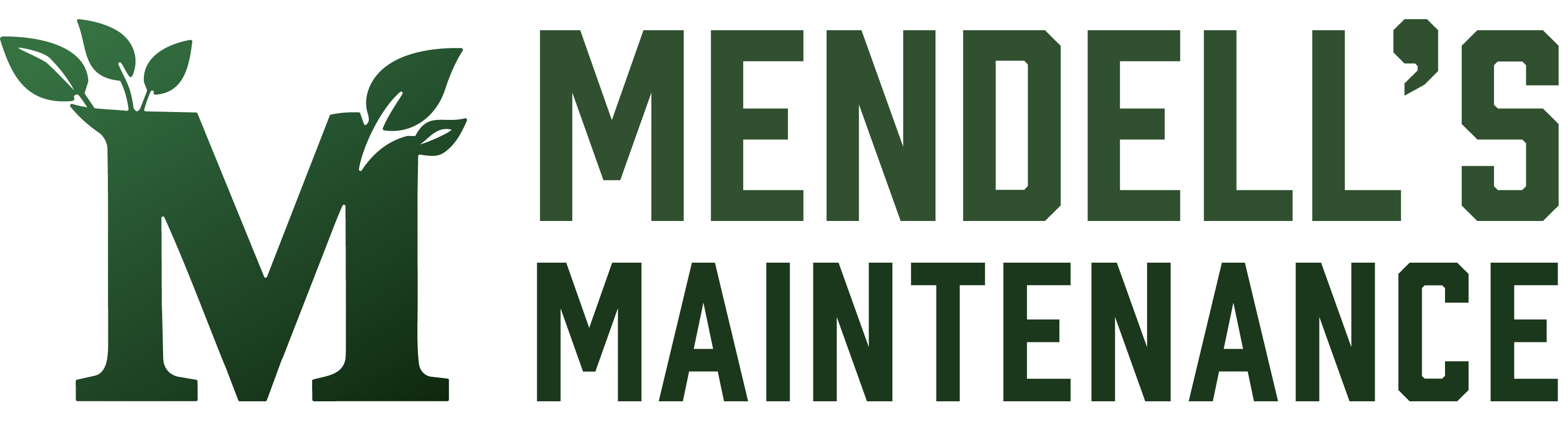
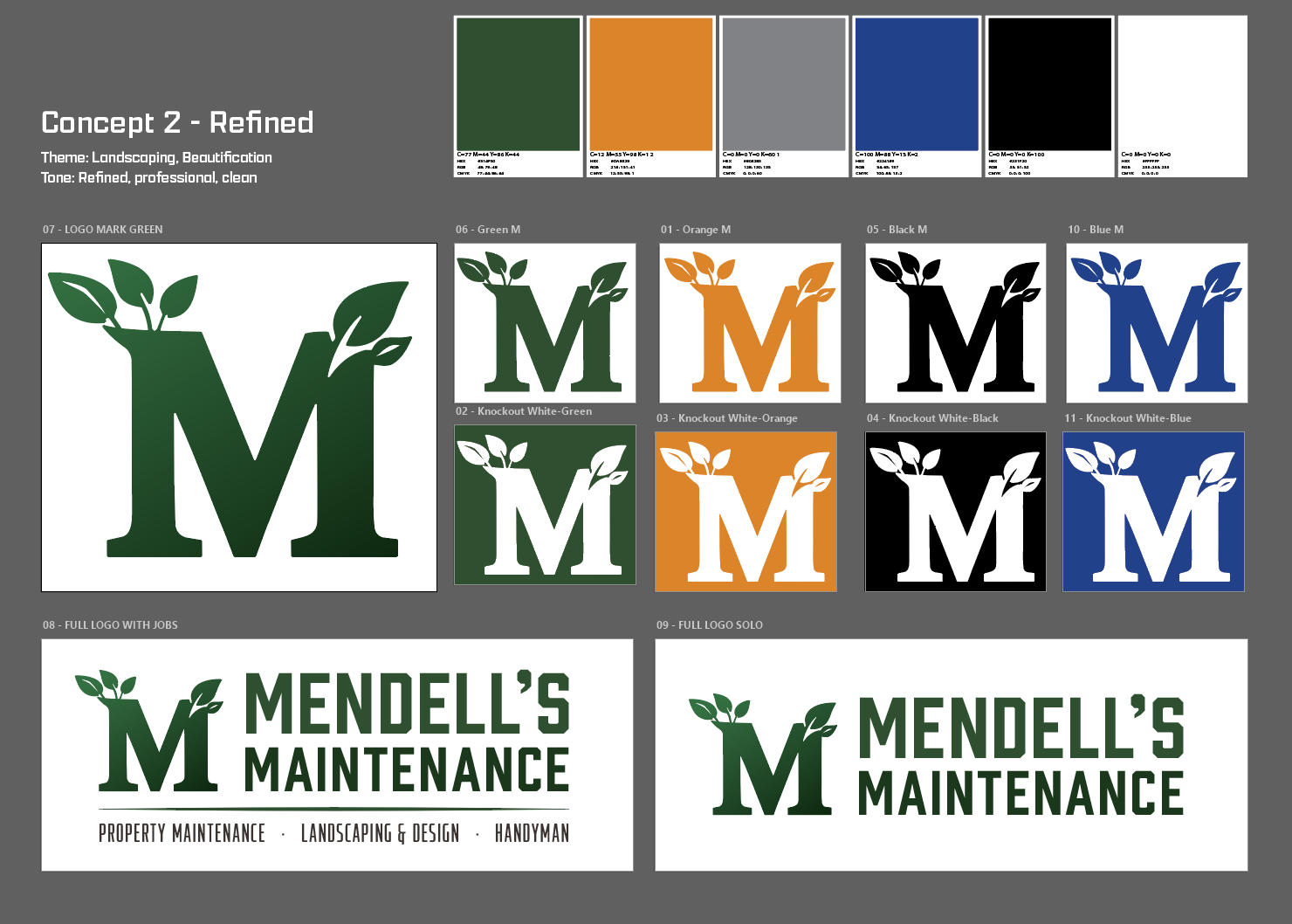
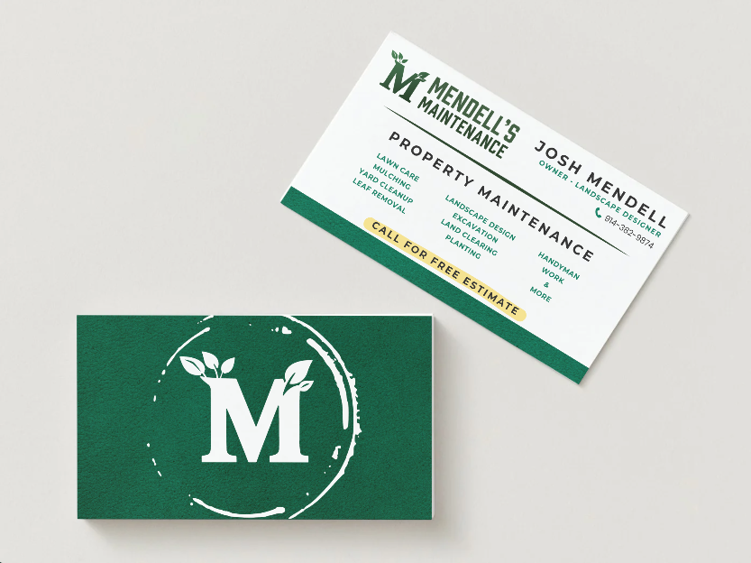
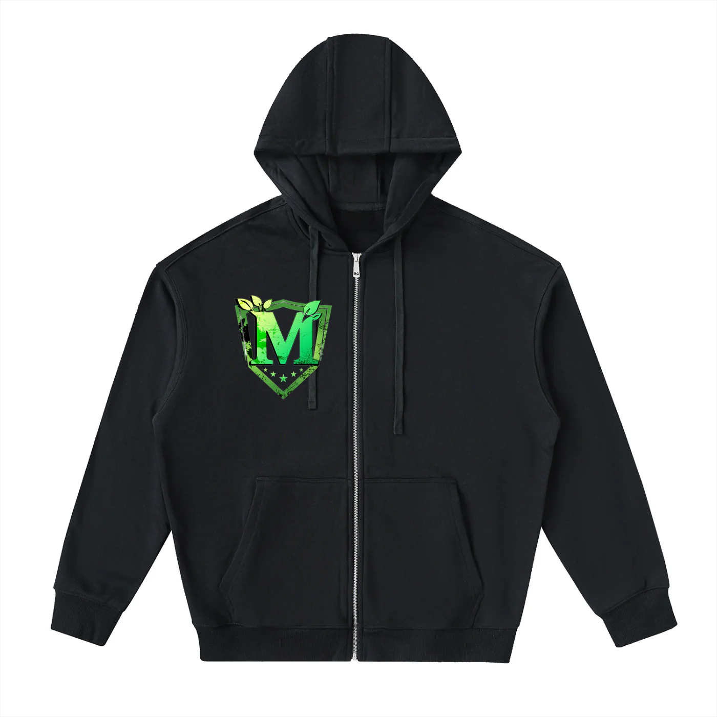
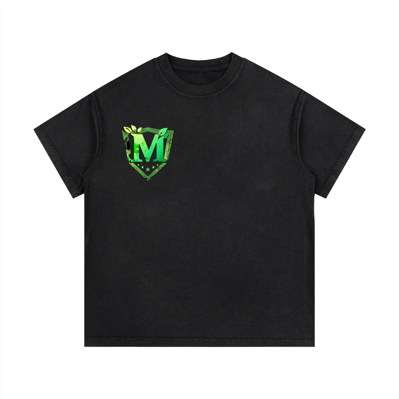
Mendell's Maintenance is a full-service property care company run by Josh Mendell out of Dutchess County, New York — lawn care, landscaping, handyman work, snow removal, and everything in between. Most property-care brands in this space read either too corporate or too DIY — nothing in between. The identity needed to feel professional enough to land commercial accounts and approachable enough to keep residential clients calling back. The result: a botanical M mark, a forest green and amber palette, and a slab serif type system — deployed across business collateral, merchandise, and social. Phase 1 of a 3-phase roadmap.


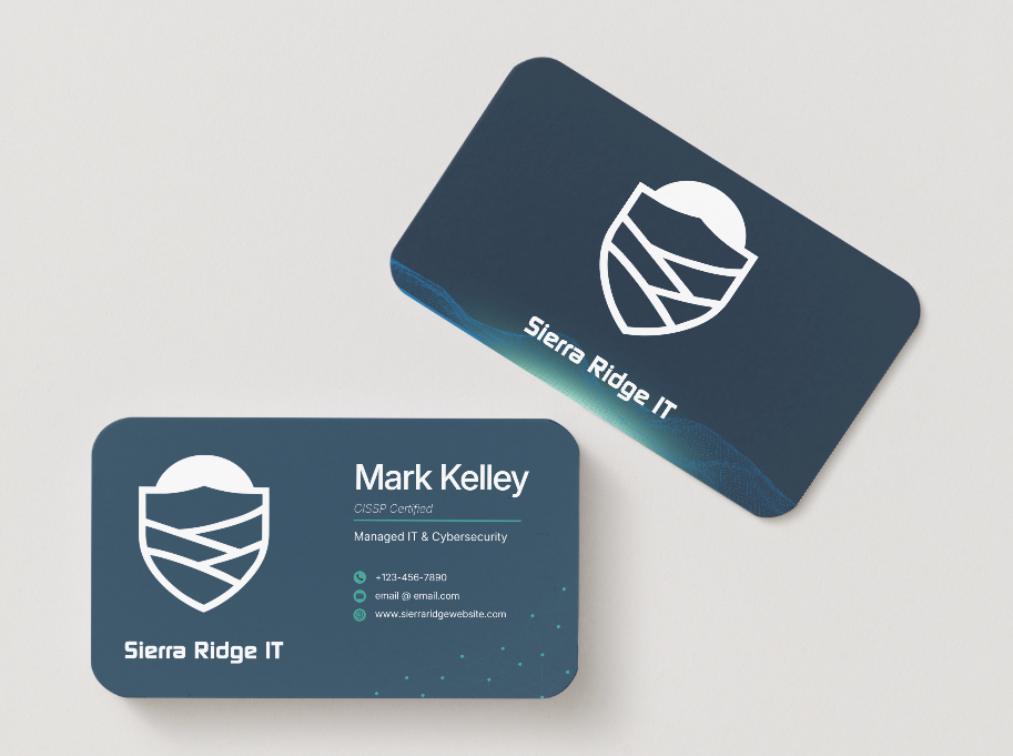
Sierra Ridge IT
A mark that earns trust on sight — no shields, no circuits
Sierra Ridge IT is a cybersecurity and managed IT firm led by Mark Kelley, CISSP. The category is crowded with generic navy-blue shield logos and stock imagery of padlocks. The ask was a mark and system that felt summit-grade — precise, calm, and unmistakably theirs. The process ran two rounds: Round 1 put three distinct directions on the table; Round 2 locked in "Solar Crest" — a custom wordmark paired with a crest icon, the Alpine Authority color system, and production SVGs delivered. Apparel and a landing page are in progress as Phase 2.

 In Progress
Apparel
T-Shirts · Hats · Polos
Crescent Psychotherapy
From no web presence to a full brand and live site — built for trust, built for Google
Yanina Mitelman, LCSW had been practicing therapy in New York for years — accepting clients via Headway, Alma, and Psychology Today — but had no standalone web presence. The ask was to build everything from zero: a logo, a visual identity, a design system, and a fully coded site. The hard constraint: nothing could feel clinical, corporate, or cold. The result is a live, production-deployed site at crescentpsychotherapy.com — custom SVG logo, design system v1.1, scroll-triggered animations, testimonial carousel, three-platform booking integration, schema.org MedicalBusiness structured data, and full Open Graph SEO. Brief to browser in weeks.
All work via DN Creative LLC
These projects were all built through DN Creative LLC — a solo design studio practice running alongside the enterprise work. Clients range from solo practitioners to nationally recognized operators. Same discipline either way: every mark, system, and line of code built to last.